
Regina Health

A complete revamp of an established nutraceutical brand in order to refresh its image with its current UK-based target audience and welcome new users (specially from South Korea) with a more relatable and friendly image
The Brief
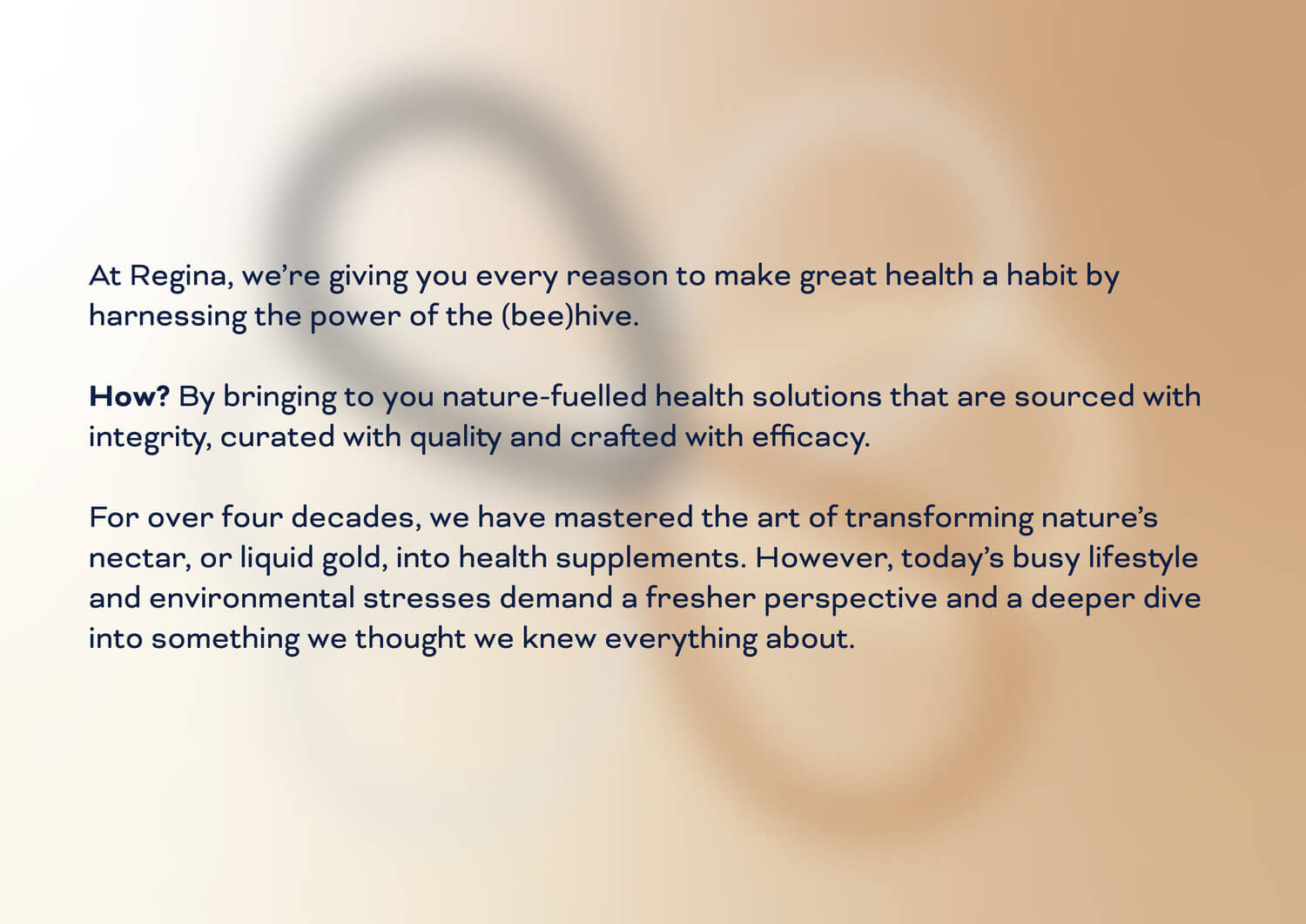
To transform the brand’s image and personality into that of a personal well wisher that truly cares for you, and your health
The Vision
Market Research, Market Strategy, Brand Positioning, Brand Story, Brand Visual Identity, Packaging, Social Media Strategy and Design Templates
The Services
Gearing up to embrace the brand’s growing loyal fan base in South Korea, it was only fitting that we started out with the main ingredient of any good brew, the beans aka the brand identity, in this case, by adding a contemporary symbol to the logo. Breaking nutraceutical stereotypes of minimalism, we brought in a touch of neutral gradients, blurs and modern typography in various elements that created a standout visual identity for the brand across assets.
The Impact